Top 10 Best Color Temperature for Hotel Restaurants?

Time:2026-11-05 Author:Charlotte
0%

Hotel restaurants must feel welcoming at breakfast, polished at dinner, and comfortable between services. Color temperature shapes that mood, but it cannot compensate for harsh glare, poor color rendering, or badly placed fixtures. So, what is the best color temperature for hotel restaurants? In many dining rooms, 2700K–3000K creates a warm, relaxed atmosphere, while 3000K–3500K can suit brighter, contemporary spaces. These ranges are starting points, not rules.

Lighting designer Richard Kelly described a layered approach using “focal glow, ambient luminescence, and play of brilliants.” His framework remains useful: a restaurant needs more than one uniform wash of light. Warm pendants above tables can flatter food and faces; brighter, well-controlled lighting near service counters helps staff work accurately. Dimmable circuits also let a room shift from morning coffee to evening dining without losing its character.

The right choice depends on finishes, daylight, menu, and brand identity. A cream-colored dining room may feel cozy at 3000K, while dark wood can appear too amber under the same setting. Check color rendering, too; accurate food and skin tones matter. Test lighting on actual plates, menus, and upholstery before committing. Small details matter.

There is no magic number. That is worth admitting. The list below compares ten practical color-temperature options, explaining where each works best, what trade-offs to expect, and how to avoid a room that looks inviting in photographs but uncomfortable in person.
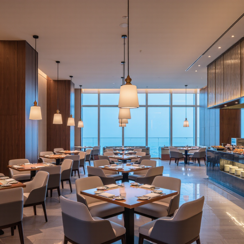
Top 10 Best Color Temperature for Hotel Restaurants?

Define CCT: 2700–3000 K gives dining rooms a warm-white ambience

For hotel restaurants, 2700–3000 K usually creates a warm-white ambience: candle-like highlights, soft timber tones, and less clinical-looking table settings. The CIE International Lighting Vocabulary defines correlated colour temperature by comparing a light source’s chromaticity with a Planckian radiator. CCT describes perceived warmth, not how faithfully food or décor appears. Details matter.

A useful technical reference is EN 12464-1:2021, which lists 200 lx maintained illuminance and Ra 80 for dining rooms. Treat these as design benchmarks, not a complete atmosphere recipe. The IES TM-30-20 method adds colour-fidelity and gamut measures, Rf and Rg, because CCT alone cannot predict how roast vegetables, sauces, or skin tones will look. Warm light can flatter a room, yet overly dim tables make menus and small details harder to see.

Test the setting after dark, with actual plates and finishes in place. A pendant may make the centre of a table glow while leaving the corners muddy. Dimming helps staff shift the room from lunch to dinner without changing the warm-white character. Still, 2700 K is not automatically better than 3000 K; wood, wall colour, and shade materials can alter the result. My own caution: a specification sheet rarely captures the room’s full feeling.

Top 10 Best Color Temperatures for Hotel Restaurants

Suggested correlated color temperature (CCT) ranges for common hotel dining and service areas.

A CCT of 2700–3000 K creates a warm-white dining ambience. Other ranges are practical starting points, not universal standards; adjust for the venue’s materials, daylight, and desired atmosphere.

Rank 10 restaurant CCT options from intimate 2700 K to crisp 4000 K

A practical ranking for hotel dining rooms follows the shift from intimate to crisp, not a universal quality score. CIE 015:2018 defines correlated color temperature through a light source’s chromaticity; it does not rate how appetizing food looks. The ten options are: 1. 2700 K, candle-warm for booths and evening service. 2. 2800 K, soft on timber and linen. 3. 2900 K, cozy, with slightly clearer table detail. 4. 3000 K, a flexible choice for mixed dining zones. 5. 3100 K, warm but more alert for breakfast-to-dinner rooms.

6. 3200 K, useful where menus and faces need added clarity. 7. 3500 K, balanced for bright interiors and varied service periods. 8. 3600 K, cleaner-looking, but less intimate under pale finishes. 9. 3800 K, crisp for daytime dining and open kitchens. 10. 4000 K, the coolest option here; it can feel clinical in a dim room. IES RP-2-20, Lighting Restaurants and Food Service Facilities, treats restaurant lighting as a combination of ambient, task, and accent needs. So test CCT with actual dishes, wall colors, and dimming levels. A creamy sauce may look different under the same setting as a red wine. This ranking is only a starting point; I would revise it after seeing the room at night.

Top 10 Best Color Temperatures for Hotel Restaurants: Ranking 10 CCT Options from Intimate 2700 K to Crisp 4000 K

Rank Color Temperature Visual Character Good Fit For Food & Material Appearance Practical Consideration
1 3000 K Warm, welcoming, and versatile Most all-day dining rooms, table seating, and hotel restaurant lounges Supports a cozy atmosphere while keeping food and finishes reasonably balanced A strong general-purpose choice; pair with high color-rendering lamps for reliable food colors.
2 2700 K Very warm, intimate, and candle-like Fine dining, evening service, intimate booths, and bar areas Enhances warm wood, brass, and amber tones; whites may appear distinctly warm Best where a relaxed evening mood is central; may feel too warm for bright breakfast service.
3 3200 K Warm-neutral with a little more clarity Casual upscale dining and restaurants serving breakfast through dinner Balances warm finishes with a clearer view of plated dishes A useful middle ground when 2700–3000 K feels too amber.
4 2800 K Soft, warm, and gently inviting Guest-facing dining rooms with traditional or residential-style interiors Flatters warm-colored materials and creates a comfortable evening feel Test with actual finishes: cream surfaces and pale foods can look warmer under this light.
5 3500 K Balanced, neutral-warm, and clear Contemporary hotel restaurants, buffet areas, and flexible dining spaces Provides a relatively neutral impression without feeling strongly cool Can suit mixed-use spaces, especially when dimming is used to adjust the evening mood.
6 2900 K Warm and relaxed, between intimate and neutral-warm Dining rooms that want warmth without the deepest amber effect Maintains a cozy look while offering slightly more visual clarity than 2700 K A practical alternative when 3000 K appears a little too neutral for the interior.
7 3300 K Comfortably warm with a clean, modern edge Modern all-day dining and spaces with a mix of warm and cool finishes Helps neutral surfaces appear less amber while retaining some warmth Check color consistency across fixtures, particularly in open-plan dining areas.
8 3600 K Neutral, crisp, and moderately cool Bright breakfast rooms, buffet counters, and daytime-focused dining Gives a clearer, less amber appearance to white surfaces and presentation areas May feel less intimate at dinner unless paired with lower light levels or warmer accent lighting.
9 3800 K Cool-neutral and distinctly crisp Bright, contemporary dining spaces and service-focused buffet zones Emphasizes clean-looking whites and cool-toned finishes Use selectively where a lively, bright feel is desired; it may not suit a romantic dinner atmosphere.
10 4000 K Cooler, neutral-white, and clean High-activity breakfast areas, buffet service, and functional dining zones Creates a crisp impression, especially on white and cool-colored surfaces Can feel clinical in an intimate restaurant; evaluate it alongside brightness, finishes, and evening use.

Selection note: These rankings are a practical starting point, not a universal rule. Color temperature describes the light’s warm-to-cool appearance; it does not determine color-rendering quality. For food presentation, consider high color rendering (for example, CRI 90 or higher), consistent fixtures, appropriate brightness, and an in-room mock-up before choosing a final specification.

Apply EN 12464-1: dining areas target 200 lx and a minimum Ra of 80

For hotel dining rooms, begin with measurable light, then choose a welcoming color temperature. EN 12464-1:2021 sets 200 lx maintained illuminance and a minimum Ra of 80 for dining areas. Measure at the table surface, not just near the ceiling. Ra 80 is a floor, not a guarantee that grilled salmon, red wine, or guests’ skin will look natural.

A warm white range of 2700–3000 K often suits evening dining, while 3000 K can keep menus and table settings clearer. These are design choices, not EN 12464-1 requirements. The standard specifies illuminance and color rendering; it does not prescribe one ideal CCT. Check the CIE color-rendering method, CIE 13.3, and inspect R9 as well: Ra averages selected colors and can miss weak saturated-red rendering. Test actual dishes.

Keep the light consistent. A 2700 K pendant above a 4000 K service area can make the room feel patchy. Not ideal. During commissioning, use a lux meter at several tables, including the darkest corner, and compare readings after dimming. One practical flaw: a beautifully warm scene may still leave menus hard to read. Test it at dinner, with real table settings, before fixing the controls.

Match color temperature to dining zones, menus, daylight, and desired mood

Hotel restaurant lighting should change with the meal, not follow one fixed Kelvin setting. The U.S. Department of Energy’s LED guide groups warm white around 2,700–3,000K and cooler white around 5,000–6,500K. Use 2,700–3,000K near intimate booths, where candlelit sauces and wood finishes feel inviting. For bright breakfast areas, try 3,000–3,500K, especially when morning daylight is limited. Keep food colors honest: overly amber light can make greens look dull, while cool light may flatten bread and roasted dishes. A useful rule, not a law.

Treat each dining zone as its own scene. A bar can tolerate brighter, more energetic light; a quiet tasting table benefits from softer illumination and good color rendering. At lunch, daylight shifts throughout the room, so check tables beside windows at different hours before choosing a final setting. WELL v2’s Circadian Lighting Design feature uses 150 equivalent melanopic lux at eye level for four hours as a daytime benchmark in applicable spaces. It is not a restaurant prescription, but it highlights why daylight and timing matter. Test actual plates under the installed fixtures, then adjust dimming and color temperature together. I’ve seen plans look balanced on paper and feel oddly cold at dinner. A small flaw worth checking.

Verify light levels, color rendering, and dimming scenes before opening

Before opening, measure light at seated eye level and directly across the table surface. A warm 2700–3000K range often suits evening dining, but the room’s finishes can shift how it feels. Dark wood absorbs light; pale stone can create glare. Use a meter to check each seating zone, rather than trusting the fixture specification. Then test again.

Color temperature is only part of the picture. Check color rendering with fresh food, skin tones, and printed menus under the actual installed lights. A CRI of 90 or higher is a useful target, especially where warm reds and natural food colors matter. Look for dull tomatoes or gray-looking faces. They reveal problems quickly. Still, a high rating cannot guarantee that every dish will look appealing.

Run every dimming scene from the controls staff will use during service. Test arrival, dinner, and late-evening settings at the same time of day, and watch for flicker, abrupt transitions, or uneven brightness between tables. Check that staff can read menus without turning on harsh task lights. A scene may look polished in an empty room but feel too dim once guests, candles, and reflective glassware are present. Adjust one zone at a time, then walk the room again.

FAQS

What color temperature suits intimate dining booths?

Warm white around 2,700–3,000K can flatter wood finishes and candlelit sauces. Test the actual plates.

Should breakfast areas use cooler lighting?

Try 3,000–3,500K when morning daylight is limited. Too much amber can dull green foods.

Should every restaurant zone use the same lighting?

No. A bar can feel brighter, while a tasting table benefits from softer light.

How can daylight affect table lighting?

Window-side tables change as daylight shifts. Check them at different hours.

Where should light levels be measured?

Measure at seated eye level and across the tabletop. Check each seating zone, not just one table.

What should staff check about food and faces?

Test fresh food, skin tones, and printed menus under installed lights. A CRI of 90 or higher is a useful target.

How should dimming scenes be tested?

Run arrival, dinner, and late-evening settings using the controls staff will operate. Watch for flicker or abrupt changes.

Why can a scene look different during service?

Guests, candles, and glassware change the room. My first setting may look polished when empty, yet feel too dim later. Walk the room again.

Conclusion

Choosing the right lighting can shape how guests experience a hotel restaurant, from a relaxed breakfast to an intimate dinner. What is the best color temperature for hotel restaurants? It depends on the atmosphere and the needs of each dining zone. Warm-white light around 2700–3000 K often creates a welcoming feel, while options ranging up to 4000 K provide a crisper appearance. These ten color-temperature choices can be considered along that spectrum, with the best fit influenced by the menu, daylight, interior finishes, and desired mood.

Color temperature should work alongside light level and color quality. As a planning reference, EN 12464-1 specifies 200 lx for dining areas and a minimum color rendering index (Ra) of 80. Before opening, check that lighting levels are suitable, food and surroundings appear natural, and dimming scenes work as intended throughout the day. Testing each zone in its actual setting helps create a comfortable, consistent experience for guests.

Charlotte

Charlotte

Charlotte is a seasoned marketing professional with a deep understanding of the company's portfolio and a passion for elevating its presence in the market. With a keen eye for detail and a commitment to excellence, she ensures that our professional blog is regularly updated with insightful articles......